
Earnt Brand Development
Earnt is an organisation that is genuinely changing the world for good. They help brands unite with causes to get good things done. Those who take part gain access to the best limited editions, the most sought-after experiences, and widely coveted tickets - creating a new kind of VIP.
When I started working with Earnt, they already had a logo, but they needed some assistance with appealing to their target market. The founder of Earnt, Lauren Scott-Harris, approached me with a specific problem.
Although Earnt had a strong brand identity, their current positioning wasn't effectively showcasing it. The images of nature, just weren’t being seen by the right people. The “Do-ers” of the world. The solution to this was to make it feel like a brand that people crave to be part of.
T-Shirts
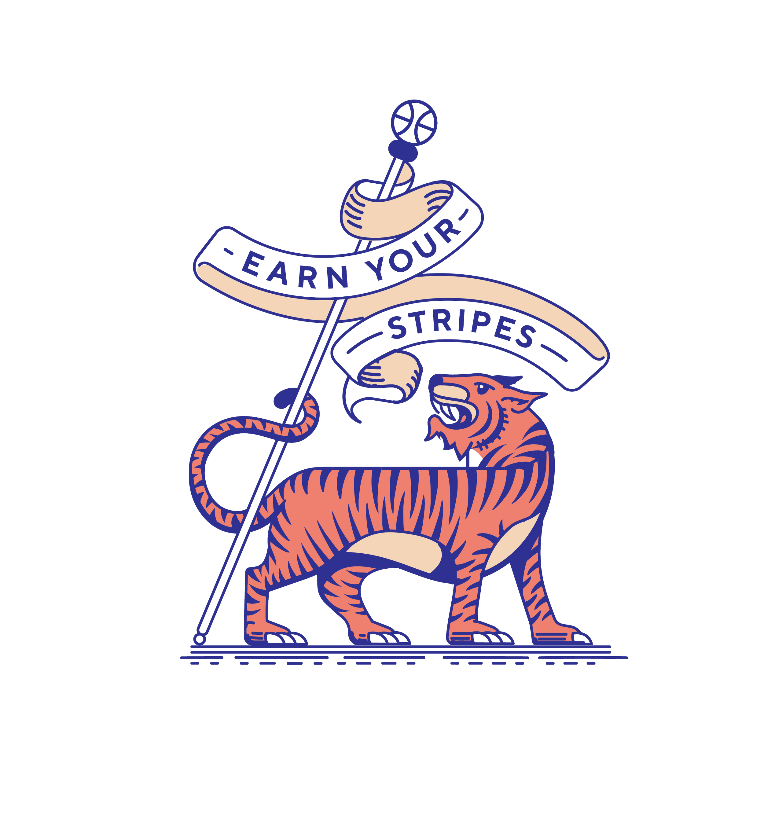
To create intrigue, we designed t-shirts that were reminiscent of old sports club logos. So that it felt like an exclusive community with pedigree. something you couldn’t just buy, something that needed to be earned. The design was to reinforce the idea of social pedigree.
Website
Earnt’s vision to change the world needed a website that echoed It’s ethos. Punchy, strong, a ‘come hell or high-water’ attitude.
By art directing the style of images, to showcase active, fashionable, defiant individuals, we created a brand presence that resonanted with their target market. People who want to change the world and defy the Status Quo.

Art Direction
It became evident that the pivotal step in aligning this brand with its target audience was the selection of imagery style. An intimate comprehension of the brand's narrative, its mission, and the intended audience was essential to discover the perfect intersection where these images could be located.
Revolution: Earnt's guiding mantra is "A revolution in Consumption." This served as an excellent starting point. The chosen style would be inspired by revolutionary poster composition and aesthetics.
Street Fashion (trendy, young, defiant): The concept underpinning their logo is "The world is Earnt's playground." They characterize their community as "change-makers."
Nature (flowers, plants): All of Earnt's endeavors are conducted in the name of nature, encompassing activities like litter picking, tree planting, and beach clean-ups. The third wellspring of inspiration is "Nature."

Typography
In keeping with the revolutionary aesthetic, the typography draws inspiration from both editorial layouts and "Call to Arms" posters. On the contact page, boxes, text, and images overlap, resembling posters, stickers, and graffiti tags on a city wall.


